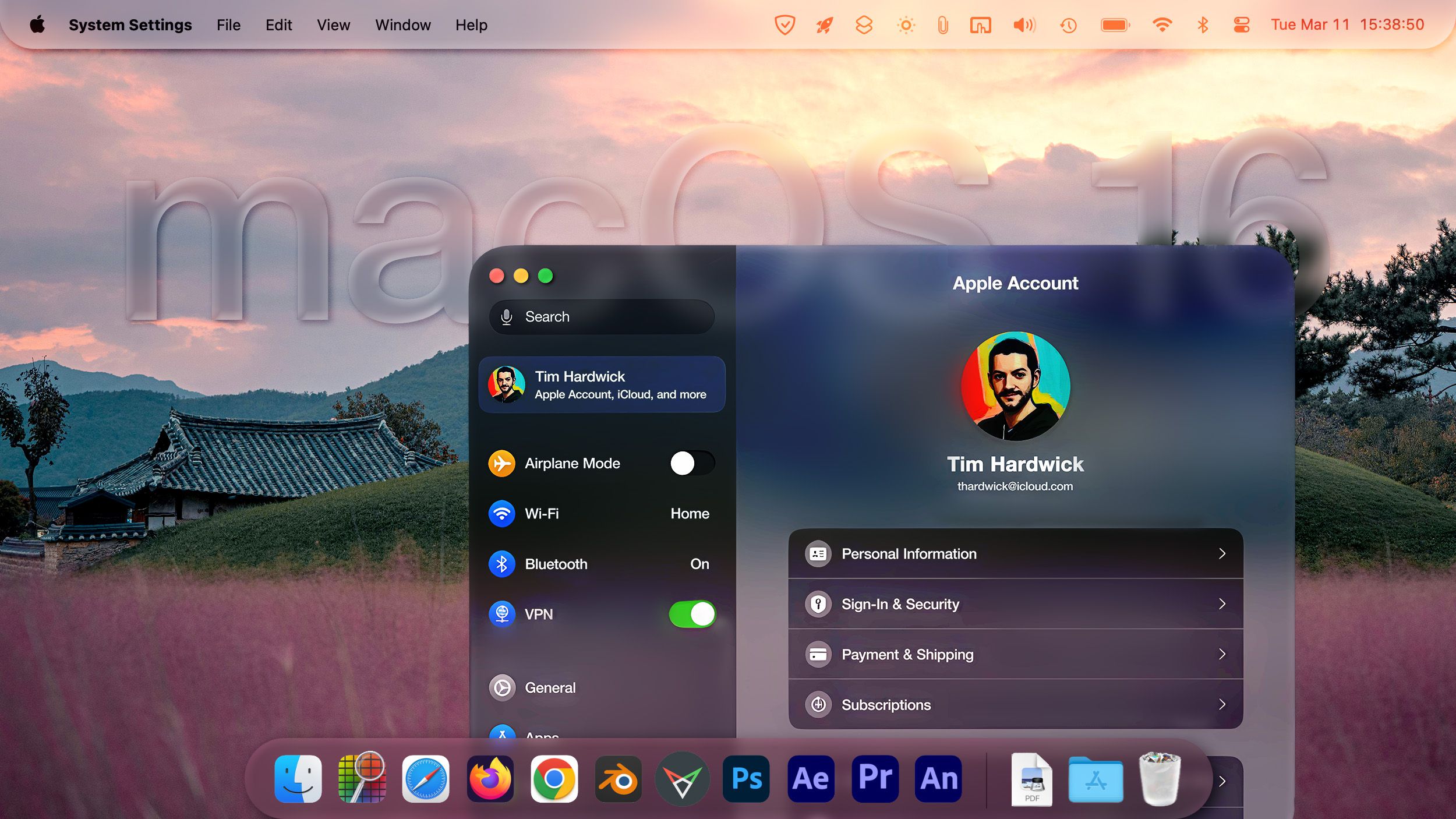
I’m not one of those guys who will poo poo change. But not much of what’s changed in the Mac UI/UX in the last 10 years has been good change. Guess we’ll see. I don’t mind visual changes - the mockup at this link is fine by me. I do mind what they did to system preferences, etc.
Yeah, you're preaching to the choir—my favorite system is still Snow Leopard
")
.
With a two-year release schedule, they had time to think deeply about making the UI as clean, powerful, and intuitive as possible. Now it seems they're just rushing to put out new features. Marketing is trumping engineering.
They do stuff that fundamentally doesn't make sense. For instance, audio books are audio media, and thus should really be in the same app as music. When you're loading music and audiobooks onto your iPhone or Watch, you want a single synced library of both so you can track and adjust the total storage required in a single app. It makes no sense to put them in the Books app.
Or how about not being able to turn off multiple desktops (a feature that was available on Snow Leopard)? I can't count the number of times I've accidentally put an app in a different desktop when moving windows around, forcing me to stop and move it back (which is not an intuitive process).
And why do they lack basic features for Safari Bookmarks, like choosing whether you want to sort them in chronological or reverse chronological order (and not letting you pin the top 10 or so in the Bookmark Sidebar)? [Granted, that was not available in SL either.]
And even when they try to create something useful and productivity-focused, it can turn out to be a disaster (like the Shortcuts app, which is the single buggiest Apple app I've ever tried using).

 www.macrumors.com