Apple/Microsoft is not going to align on "what a button is" on their platforms so long as certain buttons can be used to illicit different behaviors.
For me, truly intuitive is when the UX can be used the way the customer wants without being needed to be guided through it, or avoid pitfalls. Apple used to be great at this where they pushed to make sure that things weren’t buried and hard to find. If it was there, you could do it, if it wasn’t, you couldn’t. Now there’s more and more where that isn’t the case. So long as ‘data-driven metrics’ has a throttle-grip on engineering, it will be tough to return back to this, because that mentality of using telemetry metrics for success (and then letting the business side define them) is what drives dark patterns in the first place.
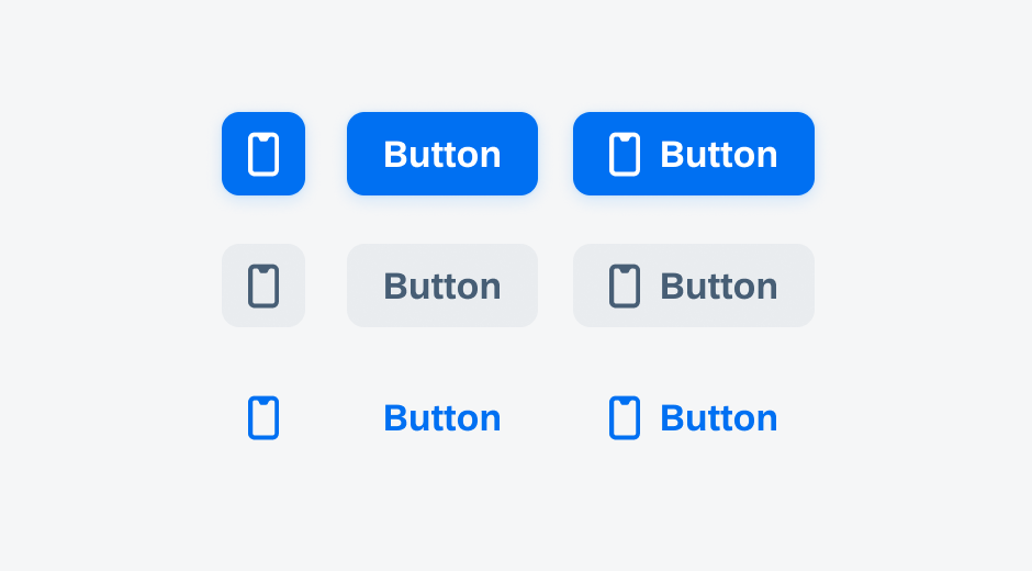
For iOS 7 the issue there is that it stripped away context that tells the user what something was. Buttons were now tappable text, navigation bars were just white space, tab bars were white space. The separation between different elements removed and/or made subtle. People with muscle memory figured it out, and we’ve seen changes that add some of that context back, but here’s an example of today’s set of "what does a button look like on iOS":
In iOS 7, Apple was pushing for just #3. So the context of what was a button was in terms of borders/etc was stripped away in favor of color. It blends into the content more. Which it turns out is not great if you want someone to know where they can tap to get actions. And now, where you have both, it’s common to mix #1 and #3 because it turns out that people are less likely to see #3 as a button if it is in the same "region" as #1, so they will tap #1 more often for you.
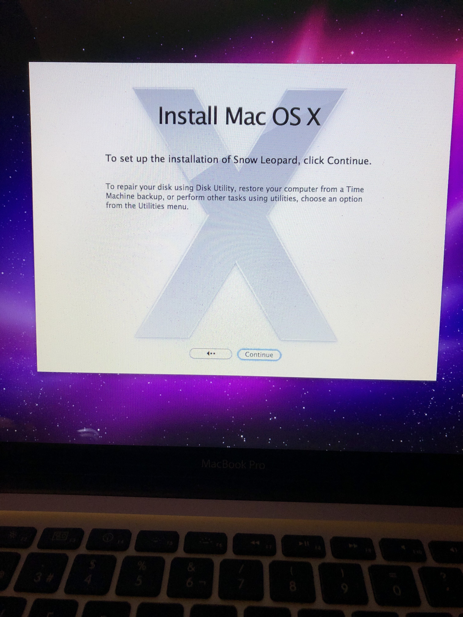
") .
.
