You are using an out of date browser. It may not display this or other websites correctly.
You should upgrade or use an alternative browser.
You should upgrade or use an alternative browser.
Electric Vehicles: Tesla specific talk, current firmware, purchasing, modifications
- Thread starter DT
- Start date
Apple fanboy
Elite Member
- Joined
- Oct 14, 2020
- Posts
- 1,613
My car had physical buttons for climate control. Can’t improve on that for convenience and safety.
- Joined
- Sep 26, 2021
- Posts
- 8,270
- Main Camera
- Sony
That's V11, it was released this past Christmas, it's been incrementally improving, like the climate shortcuts.
i’m glad it’s improving, but i don;t see the point in ever hiding basic controls like climate. It used to be so simple - driver and passenger had separate controls, located near each seat, for temperature and seat warmer. At all times.
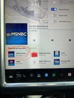
Favorite radio stations? each button was always in the same place, where you put it. Listening to a different station didn’t reshuffle everything.
Etc. Etc.
Does tesla know we are operating a moving vehicle at high speed while trying to operate these things?
- Joined
- Sep 26, 2021
- Posts
- 8,270
- Main Camera
- Sony
DT
I am so Smart! S-M-R-T!
- Joined
- Aug 18, 2020
- Posts
- 6,938
- Solutions
- 1
- Main Camera
- iPhone
Oh definitely, there are some things that need improvement, I'm just one of those people that things seems to work for me, maybe it's old age  , I don't really have issues. I pre-cool the car, we all jump in, set the AC for auto and we drive 50-250-400 miles without thinking about the AC system (or if there's a passenger desire for a change, they handle it) unless we stop and I'll manually manage if it people are getting in/out of the car (rest or charging stop).
Physical buttons? Don't care, we have a car with and a car without, doesn't really make any difference. Safety? People are farting around with AC, audio, maps, even with physical buttons people aren't reaching around the car 100% focused on front of them, I've seen analysis done on "attention", and how people will even look at the sound system if a liked, familiar songs comes on.
@Cmaier
Hahaha, dude, I've said it before ...

 www.vw.com
 www.kia.com
 www.hyundaiusa.com
 www.bmwusa.com
 rivian.com
 www.lucidmotors.com
And so on ...
Physical buttons? Don't care, we have a car with and a car without, doesn't really make any difference. Safety? People are farting around with AC, audio, maps, even with physical buttons people aren't reaching around the car 100% focused on front of them, I've seen analysis done on "attention", and how people will even look at the sound system if a liked, familiar songs comes on.
@Cmaier
Hahaha, dude, I've said it before ...

VW Electric Cars: Our Selection of EV Cars | Volkswagen
Explore VW's electric cars, from the groundbreaking ID.4 SUV to the iconic ID. Buzz van, for a fun and futuristic driving experience.
2025 Kia EV6: Long-Range, Fast-Charging with Nationwide Charging Network, All-Electric CUV | MSRP & Features | Kia
Explore the all-electric 2025 Kia EV6. With high safety ratings and features such as long-range and fast-charging, the EV6 is confidently capable.
2024 IONIQ 5 | Electric SUV, Overview | Hyundai USA
Get to know the 2024 IONIQ 5 electric SUV, winner of 3 World Car Awards featuring power up to 320 hp, EPA-est. 303 mile range, available HTRAC AWD, & more!
BMW All-Electric Vehicles | BMW USA
Explore the BMW all-electric vehicles experience and learn about the future of electromobility. Discover the BMW i difference that sets all-electric BMWs apart and how an all-electric lifestyle can result in significant savings, credits, and convenience.

Rivian: Electric Vehicles Designed For Adventure
Discover Rivian's long-range electric vehicles, innovative EV trucks, SUVs and vans built for adventure. Join the movement towards a sustainable future.

Home | Lucid Motors
Lucid is the future of sustainable mobility, designing electric cars that further reimagines the driving experience.
Site Maintenance
www.chevrolet.com
And so on ...
- Joined
- Aug 10, 2020
- Posts
- 15,691
- Solutions
- 18
- Main Camera
- Sony
I think there is something to be said for the tactile feel of physical buttons/knobs and I do miss that about my BMW but not enough to be a deal breaker. The biggest advantage for me is autosteer because it allows me a few seconds to look at the screen without worrying about swerving around as I tinker with things, add the counterweight and grab the center lane on freeways and the car is basically driving itself. While my hands are nearly always at the ready, there are times I'll go for up to an hour without actually touching it.Oh definitely, there are some things that need improvement, I'm just one of those people that things seems to work for me, maybe it's old age, I don't really have issues. I pre-cool the car, we all jump in, set the AC for auto and we drive 50-250-400 miles without thinking about the AC system (or if there's a passenger desire for a change, they handle it) unless we stop and I'll manually manage if it people are getting in/out of the car (rest or charging stop).
Physical buttons? Don't care, we have a car with and a car without, doesn't really make any difference. Safety? People are farting around with AC, audio, maps, even with physical buttons people aren't reaching around the car 100% focused on front of them, I've seen analysis done on "attention", and how people will even look at the sound system if a liked, familiar songs comes on.
@Cmaier
Hahaha, dude, I've said it before ...

VW Electric Cars: Our Selection of EV Cars | Volkswagen
Explore VW's electric cars, from the groundbreaking ID.4 SUV to the iconic ID. Buzz van, for a fun and futuristic driving experience.www.vw.com
2025 Kia EV6: Long-Range, Fast-Charging with Nationwide Charging Network, All-Electric CUV | MSRP & Features | Kia
Explore the all-electric 2025 Kia EV6. With high safety ratings and features such as long-range and fast-charging, the EV6 is confidently capable.www.kia.com
2024 IONIQ 5 | Electric SUV, Overview | Hyundai USA
Get to know the 2024 IONIQ 5 electric SUV, winner of 3 World Car Awards featuring power up to 320 hp, EPA-est. 303 mile range, available HTRAC AWD, & more!www.hyundaiusa.com
BMW All-Electric Vehicles | BMW USA
Explore the BMW all-electric vehicles experience and learn about the future of electromobility. Discover the BMW i difference that sets all-electric BMWs apart and how an all-electric lifestyle can result in significant savings, credits, and convenience.www.bmwusa.com

Rivian: Electric Vehicles Designed For Adventure
Discover Rivian's long-range electric vehicles, innovative EV trucks, SUVs and vans built for adventure. Join the movement towards a sustainable future.rivian.com

Home | Lucid Motors
Lucid is the future of sustainable mobility, designing electric cars that further reimagines the driving experience.www.lucidmotors.com
Site Maintenance
www.chevrolet.com
And so on ...
- Joined
- Sep 26, 2021
- Posts
- 8,270
- Main Camera
- Sony
Oh definitely, there are some things that need improvement, I'm just one of those people that things seems to work for me, maybe it's old age, I don't really have issues. I pre-cool the car, we all jump in, set the AC for auto and we drive 50-250-400 miles without thinking about the AC system (or if there's a passenger desire for a change, they handle it) unless we stop and I'll manually manage if it people are getting in/out of the car (rest or charging stop).
Physical buttons? Don't care, we have a car with and a car without, doesn't really make any difference. Safety? People are farting around with AC, audio, maps, even with physical buttons people aren't reaching around the car 100% focused on front of them, I've seen analysis done on "attention", and how people will even look at the sound system if a liked, familiar songs comes on.
@Cmaier
Hahaha, dude, I've said it before ...

VW Electric Cars: Our Selection of EV Cars | Volkswagen
Explore VW's electric cars, from the groundbreaking ID.4 SUV to the iconic ID. Buzz van, for a fun and futuristic driving experience.www.vw.com
2025 Kia EV6: Long-Range, Fast-Charging with Nationwide Charging Network, All-Electric CUV | MSRP & Features | Kia
Explore the all-electric 2025 Kia EV6. With high safety ratings and features such as long-range and fast-charging, the EV6 is confidently capable.www.kia.com
2024 IONIQ 5 | Electric SUV, Overview | Hyundai USA
Get to know the 2024 IONIQ 5 electric SUV, winner of 3 World Car Awards featuring power up to 320 hp, EPA-est. 303 mile range, available HTRAC AWD, & more!www.hyundaiusa.com
BMW All-Electric Vehicles | BMW USA
Explore the BMW all-electric vehicles experience and learn about the future of electromobility. Discover the BMW i difference that sets all-electric BMWs apart and how an all-electric lifestyle can result in significant savings, credits, and convenience.www.bmwusa.com

Rivian: Electric Vehicles Designed For Adventure
Discover Rivian's long-range electric vehicles, innovative EV trucks, SUVs and vans built for adventure. Join the movement towards a sustainable future.rivian.com

Home | Lucid Motors
Lucid is the future of sustainable mobility, designing electric cars that further reimagines the driving experience.www.lucidmotors.com
Site Maintenance
www.chevrolet.com
And so on ...
Sorry. I’m offended by bad UX.
Being married to a human woman, she likes the temperature hotter than me. She uses the seat warmer and I do not. It used to be that she could just hit the controls that were right there. Now you have to hit a control on my side of the screen or slide up or something to get to those controls. And what’s worse is that the area of the screen where those controls used to be is now empty! I can’t put OTHER controls there. It’s just empty space. Some of it is used when you change the temperature and hit “sync” to un sync the temperatures, but why not just do it the old way which made perfect sense? If you use the left temperature control, by default it controls both zones, whereas the right un syncs and controls just the right zone? Why reverse it so that if the passenger wants to change her personal temperature it requires multiple steps using controls far away from her?
As for media presets, now it’s completely confusing what happens when I use the steering wheel controls to change stations, because the order of the stations bears no resemblance at all to what is visible on the touch screen.
Did Tesla hire some interface gurus from Microsoft to fuck this up so bad, or is Elon letting one of his secret kids intern in the software department or what?
I won’t even get into how changing media sources got more confusing and causes windows to jump around and change size, how changing categories in the sirius app is now a horizontal scrolling list where you can’t see all the entries at once, how controls like the defrosters are now hidden, etc.
It’s a freaking car. In the history of cars, there are certain controls that were always exposed, for good reason - temperature, radio stations, defrosters, etc. Why the hell hide these behind swipes and taps just so that there is more blank unused space on the interface? I simply don’t get it.
- Joined
- Aug 10, 2020
- Posts
- 15,691
- Solutions
- 18
- Main Camera
- Sony
I can't disagree here, many times I've had to google basic functions and if you're driving and don't know then just forget about it until you've stopped and put it into park. Basic features should be simple and at your fingertips, not nested into some sub area that takes you several taps to get to.Sorry. I’m offended by bad UX.
Being married to a human woman, she likes the temperature hotter than me. She uses the seat warmer and I do not. It used to be that she could just hit the controls that were right there. Now you have to hit a control on my side of the screen or slide up or something to get to those controls. And what’s worse is that the area of the screen where those controls used to be is now empty! I can’t put OTHER controls there. It’s just empty space. Some of it is used when you change the temperature and hit “sync” to un sync the temperatures, but why not just do it the old way which made perfect sense? If you use the left temperature control, by default it controls both zones, whereas the right un syncs and controls just the right zone? Why reverse it so that if the passenger wants to change her personal temperature it requires multiple steps using controls far away from her?
As for media presets, now it’s completely confusing what happens when I use the steering wheel controls to change stations, because the order of the stations bears no resemblance at all to what is visible on the touch screen.
Did Tesla hire some interface gurus from Microsoft to fuck this up so bad, or is Elon letting one of his secret kids intern in the software department or what?
I won’t even get into how changing media sources got more confusing and causes windows to jump around and change size, how changing categories in the sirius app is now a horizontal scrolling list where you can’t see all the entries at once, how controls like the defrosters are now hidden, etc.
It’s a freaking car. In the history of cars, there are certain controls that were always exposed, for good reason - temperature, radio stations, defrosters, etc. Why the hell hide these behind swipes and taps just so that there is more blank unused space on the interface? I simply don’t get it.
- Joined
- Sep 26, 2021
- Posts
- 8,270
- Main Camera
- Sony
Right, see list of alternatives above
I'd definitely get an order in, who knows when anything will actually show up!
So because Tesla decided to change my user interface 9 years after I bought the car, I should toss out a $100k car and buy a new one?
I’ll say this much - if and when Apple decides to actually come out with a car, they‘re going to wipe the floor with Tesla if this shit is the best Elon can do. You can say “I don’t need CarPlay” all the way home, but in 2027 when your Model 3 now requires you to draw a pictogram on the screen with your finger in order to change the media source, you’ll be happy to try out Apple Car.
DT
I am so Smart! S-M-R-T!
- Joined
- Aug 18, 2020
- Posts
- 6,938
- Solutions
- 1
- Main Camera
- iPhone
@Cmaier
Hahaha, dude, don't get me wrong, I totally get it. You've also had a pretty poor overall ownership experience (based on various comments here), so I can again, totally understand you being a little hostile towards the car.
Ours has been pretty much perfect, quiet, fast, put together, well, OK, I can get close to 300 miles out of it, charges quick, it's fun to drive, so my reaction to the admittedly craptacular UI choices kind of get diluted with the other attributes that are excellent, but it clearly needs improvement.
DT
I am so Smart! S-M-R-T!
- Joined
- Aug 18, 2020
- Posts
- 6,938
- Solutions
- 1
- Main Camera
- iPhone
And to answer your question: yes 
A 9-year old car, that has good value (I would think ...) in the used marketplace, that you've ( I assume) gotten a reasonable amount of use out of, that's currently not giving you the service level/ownership experience you desire, I'd shop something else. If you were upside down on a note, or were short time where you might would want to give it a chance? Probably not.
And I'm not being dismissive about the cost of a new car, but if you're that unhappy and have been for an long time - and things are likely not to change to your satisfaction or possible get worse? I'd definitely start shopping around, maybe even get Carvana, Vroom, etc., quotes.
I'd also point out that we've had ours for just over a year, no service issues, so obviously, I'm still on the honeymoon, so my perspective is a bit different (and we won't own this vehicle past the warranty expiration).
- Joined
- Sep 26, 2021
- Posts
- 8,270
- Main Camera
- Sony
And to answer your question: yes
A 9-year old car, that has good value (I would think ...) in the used marketplace, that you've ( I assume) gotten a reasonable amount of use out of, that's currently not giving you the service level/ownership experience you desire, I'd shop something else. if you were upside down on a note, or were short time where you might would want to give it a change? Probably not.
And I'm not being dismissive about the cost of a new car, but if you're that unhappy and have been for an long time - and things are likely not to change to your satisfaction or possible get worse? I'd definitely start shopping around, maybe even get Carvana, Vroom, etc., quotes.
I'd also point out that we've had ours for just over a year, no service issues, so obviously, I'm still on the honeymoon, so my perspective is a bit different (and we won't own this vehicle past the warranty expiration).
My philosophy on cars is to own them as long as I can - until the cost of maintenance makes continued ownership unreasonable. I’d be lucky to get more than $30k if I sold it (who wants to buy a tesla with a 9-year-old battery). Tesla, fwiw, will only give me $15k in trade in, so I’m guessing other carmakers wouldn’t give me much more than that. Practically speaking, getting even a much cheaper new electric car would be $30k less money in my pocket if I assume a $60k car (including taxes and fees and the cost of a dealing with new charging equipment at home). Given that my car works and gets me to work and back, reducing my bank account by $30k for CarPlay seems a bit extreme.
DT
I am so Smart! S-M-R-T!
- Joined
- Aug 18, 2020
- Posts
- 6,938
- Solutions
- 1
- Main Camera
- iPhone
I hear you, and I know you've mentioned wanting to keep the current car until you know your future needs a little better (like a much smaller "city car", or no car at all).
Again, I wasn't being casually dismissive of you plunking down $50K+ or whatever, it's just at some point in your life, if something is causing you that level of grief, me personally, I do what's necessary even if it doesn't always make complete financial sense (I have a story about that exact thing, but it needs to be told in person, over a/many beers )
)
I've gone on record to say a year ago? My same car, zero questions. Like on a likelihood scale to purchase, where 1 = NFW, and 10 = absolutely, unequivocally yes, that purchase a year ago was a 10. Today? In my desired market segment, there's only on true player (BMW I4) and some peripheral options that get a little SUV-ish (Kia EV 6 / Ioniq 5) or more than I choose to spend (Lucid), but I'd still carefully research, and I'd give it maybe an 8 if buying today.
I can tell you, in 2 years, unless things radically change at Tesla and every other manufactur just shits the bed, that number will be __much__ lower.
Again, I wasn't being casually dismissive of you plunking down $50K+ or whatever, it's just at some point in your life, if something is causing you that level of grief, me personally, I do what's necessary even if it doesn't always make complete financial sense (I have a story about that exact thing, but it needs to be told in person, over a/many beers
I've gone on record to say a year ago? My same car, zero questions. Like on a likelihood scale to purchase, where 1 = NFW, and 10 = absolutely, unequivocally yes, that purchase a year ago was a 10. Today? In my desired market segment, there's only on true player (BMW I4) and some peripheral options that get a little SUV-ish (Kia EV 6 / Ioniq 5) or more than I choose to spend (Lucid), but I'd still carefully research, and I'd give it maybe an 8 if buying today.
I can tell you, in 2 years, unless things radically change at Tesla and every other manufactur just shits the bed, that number will be __much__ lower.
Apple fanboy
Elite Member
- Joined
- Oct 14, 2020
- Posts
- 1,613
With all these complications Tesla is adding for even the simplest of basic in car functions, do you think it’s just a way to make people buy the self driving upgrades?
Or am I just being cynical?
Or am I just being cynical?
- Joined
- Sep 26, 2021
- Posts
- 8,270
- Main Camera
- Sony
Nah, i don’t think anyone is going to fork over $6000 or $12000 just so they can sometimes take their hands off the wheel to change the radio station.With all these complications Tesla is adding for even the simplest of basic in car functions, do you think it’s just a way to make people buy the self driving upgrades?
Or am I just being cynical?
I think it’s just supremely untalented UX/UI designers who care more about making things pretty than useful.
diamond.g
Elite Member
- Joined
- Dec 24, 2021
- Posts
- 1,167
Why did you update without looking at either Reddit or TMC for the list of changes for older vehicles?Nah, i don’t think anyone is going to fork over $6000 or $12000 just so they can sometimes take their hands off the wheel to change the radio station.
I think it’s just supremely untalented UX/UI designers who care more about making things pretty than useful.
- Joined
- Sep 26, 2021
- Posts
- 8,270
- Main Camera
- Sony
Why did you update without looking at either Reddit or TMC for the list of changes for older vehicles?
because when it tells me it is going to update, it doesn’t tell me what version or any information at all. How would i even know what to look for?
- Joined
- Aug 10, 2020
- Posts
- 15,691
- Solutions
- 18
- Main Camera
- Sony
I'm the same way, as soon as it's available and parked I let tell it to go.because when it tells me it is going to update, it doesn’t tell me what version or any information at all. How would i even know what to look for?
- Joined
- Sep 26, 2021
- Posts
- 8,270
- Main Camera
- Sony
I keep hoping “this will be the one that fixes it so my center console doesn’t spontaneously reboot itself once a week when I put the car in reverse” but it’s never that…I'm the same way, as soon as it's available and parked I let tell it to go.

