Seeking advice: Which photo to print and frame?

Citysnaps

Elite Member
Staff Member
Site Donor
Posts
3,694
Reaction score
8,995
Main Camera
iPhone
I have two photos of the same subject. I want to print and frame one to go on a wall. Either one can be printed in color or B&W. The horizontal photo can also be cropped square.

Would appreciate any opinions/comments regarding which would be the strongest and most impactful. Many hanks in advance!


FurHat.jpg
fur hat.jpg
 

Eric

Mama's lil stinker
Posts
11,437
Reaction score
22,077
Location
California
Instagram
Main Camera
Sony
1st one either color or B&W
Agreed.

I know it's really tough curating your own work. I had a long conversation with the lady who did it for Fred Lyon's books and one thing she said that really stuck with me was "you marry yourself to certain images, whether they're good or not, so you want someone else making that decision". We discussed some of the images and she said he didn't always like her decisions, so we may have never seen them otherwise.

The book Magnum Contact Sheets really sheds some light on it, how photographers sent publishers their whole roles and they would often choose ones the photographers didn't like. Today we have social media so we can at least use that to see which one's do and don't get feedback/likes so it makes it much easier.
 

Roller

Elite Member
Posts
1,443
Reaction score
2,813
I prefer the first one. The subject occupies more of the frame, and her averted gaze makes her more mysterious. Also, the street in the second photo is more distracting.

I’d like to see the first shot in B&W to see if the car’s headlights would become a bit less prominent. You could also tone them down digitally.
 

Citysnaps

Elite Member
Staff Member
Site Donor
Posts
3,694
Reaction score
8,995
Main Camera
iPhone
Hey! I really appreciate everyone's views and opinions - thank you!

I also posted the two photos on Facebook and my photographer friends' opinions varied. Some like the B&W one because of eye contact and B&W feeling more mysterious. Other's, the color photo because her fuchsia colored jacket really popped.

One thing I need to do is look at the original digital files, as the photos seen here I processed a decade ago and are likely cropped some. That may drive the decision needing some extra room for mat overlay not wanting to put the window edges right at the edge of what's seen here, or close to some elements in the frame.

I think the B&W one could be cropped (while maintaining the same aspect ratio) around where the headlight is, eliminating some unnecessary distracting cruft. And if the headlight is still in the frame it can be burned down. Also... her fur hat needs work revealing more detail as it's underexposed (easily done in Lightroom).

The vertical color image may have an issue on the right side as the mat window edge could be visually uncomfortably close to her jacket. Thus needing to look at the original digital files.

I might print and frame both after working on the files. One of them will go in our home's entry way where I already have a bunch of photos and some of my wife's art, some metal work, and some kitsch. All of those photos are B&W - which will/may drive the decision on color vs B&W for the above photos. My office walls have no more room for photos.
 

Citysnaps

Elite Member
Staff Member
Site Donor
Posts
3,694
Reaction score
8,995
Main Camera
iPhone
I know it's really tough curating your own work. I had a long conversation with the lady who did it for Fred Lyon's books and one thing she said that really stuck with me was "you marry yourself to certain images, whether they're good or not, so you want someone else making that decision".

Spot-on on that!
 

mollyc

seeker of light
Site Donor
Posts
1,237
Reaction score
4,088
Main Camera
Fujifilm
I prefer the color versions because I think that magenta makes her outfit - it's loud and bold and it helps tell her story more. I probably prefer the first one, but I'm not sure I like the background being quite so subdued. I am not sure if that was purposeful or not, but to me it feels unbalanced, almost like you used selective color. I'd personally warm up that street background a bit to balance the sides a bit more.

BTW, you said in a different thread that she is famous, but I don't recognize her. Who is she?
 

Citysnaps

Elite Member
Staff Member
Site Donor
Posts
3,694
Reaction score
8,995
Main Camera
iPhone
I prefer the color versions because I think that magenta makes her outfit - it's loud and bold and it helps tell her story more. I probably prefer the first one, but I'm not sure I like the background being quite so subdued. I am not sure if that was purposeful or not, but to me it feels unbalanced, almost like you used selective color. I'd personally warm up that street background a bit to balance the sides a bit more.

BTW, you said in a different thread that she is famous, but I don't recognize her. Who is she?

Thanks! Her jacket makes it for me (and is lost in B&W).

"I probably prefer the first one, but I'm not sure I like the background being quite so subdued. I am not sure if that was purposeful or not, but to me it feels unbalanced, almost like you used selective color. I'd personally warm up that street background a bit to balance the sides a bit more."

Subdued is somewhat purposeful. I often burn down elements into the shadows to hide information, to help stir a viewer's imagination - and especially if it's distracting. And to keep a viewer's eyes more on the subject. I agree the hue could be warmed up to better go with the subject. I'll give that a try.

I didn't realize it at the time, but I'm 99% sure the woman is Joan Collins (starring way back in a TV series called Dynasty). She wouldn't tell me her name after I introduced myself and hit her up for a couple portraits. Out of hundreds of posed street portraits of strangers in SF, she was the only one who wouldn't tell me her first name.
 

Roller

Elite Member
Posts
1,443
Reaction score
2,813
Thanks! Her jacket makes it for me (and is lost in B&W).

"I probably prefer the first one, but I'm not sure I like the background being quite so subdued. I am not sure if that was purposeful or not, but to me it feels unbalanced, almost like you used selective color. I'd personally warm up that street background a bit to balance the sides a bit more."

Subdued is somewhat purposeful. I often burn down elements into the shadows to hide information, to help stir a viewer's imagination - and especially if it's distracting. And to keep a viewer's eyes more on the subject. I agree the hue could be warmed up to better go with the subject. I'll give that a try.

I didn't realize it at the time, but I'm 99% sure the woman is Joan Collins (starring way back in a TV series called Dynasty). She wouldn't tell me her name after I introduced myself and hit her up for a couple portraits. Out of hundreds of posed street portraits of strangers in SF, she was the only one who wouldn't tell me her first name.
Definitely could be Joan Collins. Did she have a British accent?

Star Trek fans remember her as Edith Keeler in The City on the Edge of Forever, one of the best episodes in the Trek universe.
 

Citysnaps

Elite Member
Staff Member
Site Donor
Posts
3,694
Reaction score
8,995
Main Camera
iPhone
Definitely could be Joan Collins. Did she have a British accent?

Star Trek fans remember her as Edith Keeler in The City on the Edge of Forever, one of the best episodes in the Trek universe.

She did, a slight one. Which kind of clinched it for me later after figuring out who it could be. A friend told me she had a sister in San Francisco, also adding to the conclusion. I'm guessing she was weary of people fawning over her and her career as an actress. It was her jawline and accent that put me on the right track. Also...she reflexively assumed the pose in the color photograph, as if she's done that before hundreds of times in the past. Her clothes and jewelry, too.
 
Last edited:

Citysnaps

Elite Member
Staff Member
Site Donor
Posts
3,694
Reaction score
8,995
Main Camera
iPhone
After thinking about this some more, I'm going to try the horizontal photograph in color. The way her jacket pops in color really does it for me. Also... I'm not really pleased with that sliver of background on the left in the vertical photo. Which will be even narrower after matting (assuming the original digital image is that way and not cropped) making it look even more weird.
 

ArgoDuck

Power User
Site Donor
Posts
106
Reaction score
168
Location
New Zealand
Main Camera
Canon
Only just saw this. Definitely the 2nd (horizontal) for me. It has more complexity. She stands out because she’s in focus and in the foreground, yet there’s enough in the background to tease us with time and place, a sense of context

Her direct gaze at the camera - even with her eyes in part shadow - strengthen her presence. She sees us and is curious about us as much as we see and are curious about her. She engages with us

I like B&W with this image because it blends her with that background (but doesn’t subsume her) and so supports that sense of context, of belonging. However, that may run counter to your words "strongest and most impactful", in which case color may indeed be best ;)

These are great images
 

Citysnaps

Elite Member
Staff Member
Site Donor
Posts
3,694
Reaction score
8,995
Main Camera
iPhone
Only just saw this. Definitely the 2nd (horizontal) for me. It has more complexity. She stands out because she’s in focus and in the foreground, yet there’s enough in the background to tease us with time and place, a sense of context

Her direct gaze at the camera - even with her eyes in part shadow - strengthen her presence. She sees us and is curious about us as much as we see and are curious about her. She engages with us

I like B&W with this image because it blends her with that background (but doesn’t subsume her) and so supports that sense of context, of belonging. However, that may run counter to your words "strongest and most impactful", in which case color may indeed be best ;)

These are great images

Hey... thanks for for weighing in with your assessment - I appreciate it!

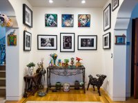
The area where it will be hung (our home's entryway) has all B&W photos (along with a bunch of other stuff), thus it should really be in B&W. I'll probably replace one already hanging that's horizontal.

Either the one on the right edge of the back wall (above the pig), or, the square one on the left side wall, close to the ceiling. I'm leaning to replacing the one on the back wall. I might make another horizontal one in color for hanging somewhere else.
 

Attachments

  • Entry 8-10-23.jpg
    Entry 8-10-23.jpg
    178.4 KB · Views: 17

Citysnaps

Elite Member
Staff Member
Site Donor
Posts
3,694
Reaction score
8,995
Main Camera
iPhone
I found the original files and edited the horizontal version in color, along with warming up the background a bit, and knocking down the brightness of the sky a little so it wouldn't compete for a viewer's eye:

Fur hat 8-11-23.jpg
 
Top Bottom
1 2